You wake up to a color-graded world, everything is crafted and symmetrical, and you feel nostalgic but don’t know why. There’s only one explanation, isn’t there? You are a character in a Wes Anderson film.
Wes Anderson is a filmmaker whose stories champion an individual style that is very much enjoyed and beloved by many, myself included. His aesthetic could possibly even be recognizable to those who haven’t seen many of his works. Anderson’s signature style is often represented by symmetrical frames, detailed art direction and deadpan dialogues, to name a few. Even though it’s safe to say all his films include these features, each one of them are also distinct from one another.
His newest, The French Dispatch, comes to theaters this October. The film comprises three main storylines, all centering around journalism, but set in different places and follows different characters, played by stars such as Bill Murray, Frances McDormand, Tilda Swinton, Timothée Chalamet and Jeffrey Wright.
In the film’s trailer, audiences can see not only the filmmaker’s individual style, but also a new atmosphere brought forth by this new kind of story we are about to witness. Anderson and his fellow crew took time and care to select and mold real-life locations into sets for the film.
To celebrate this new release, let’s look back at Wes Anderson’s previous works and how his shaped worlds spotlight his stories and the people in them.
The Grand Budapest
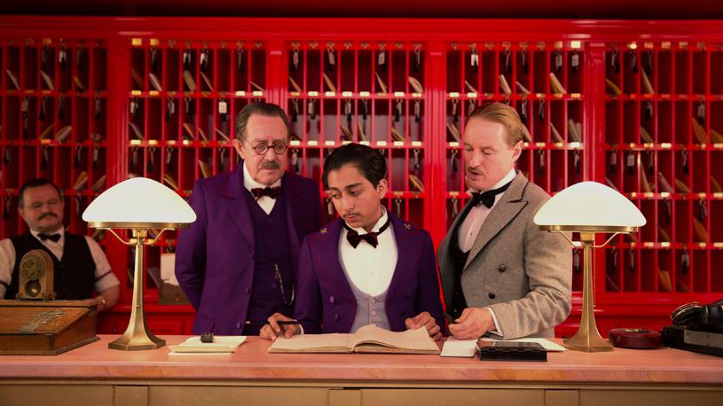
His most recent live-action before Dispatch is the Ralph Fiennes-led The Grand Budapest Hotel. Fiennes portrayed the titular hotel’s concierge Gustave H., as he became caught in a murder case. The film is set in a fictional country called Zubrowka, but most of the actual filming took place in Görlitz, Germany. The interior of an empty department store in the town was refurbished to become The Grand Budapest we see on screen.
The film portrays The Grand Budapest against a wintery backdrop of 1930s Europe—the building’s pink exterior with its blue highlights giving the impression of a whimsical escapist fortress. Certainly, the interior is equally flashy, with matching pink walls, velvet red carpeting, and purple staff uniforms.

(L-R) Larry Pine, Tony Revolori and Owen Wilson in The Grand Budapest Hotel. Source: Searchlight Pictures
Adam Stockhausen, the film’s production designer, noted that the hotel’s space mirrors Gustave’s characteristics. The concierge being a meticulous and pernickety figure with a flirty side, The Grand Budapest is packed with detailed furnishing and pops of colors (complementary shades, of course)— reflective of the man who runs it. The art reflects the artist, no?
The film also goes back and forth between the hotel’s prime years and three decades later, in 1968. During this time, the hotel’s interiors are completely different. The pinks are no more, instead they are replaced with brown furnishing with mint green touches. The building’s exterior also experienced a downgrade to look like a passable building. Without Gustave’s personal touch, the hotel seemed less fashionable, of course, but also smaller.
Moonrise Kingdom
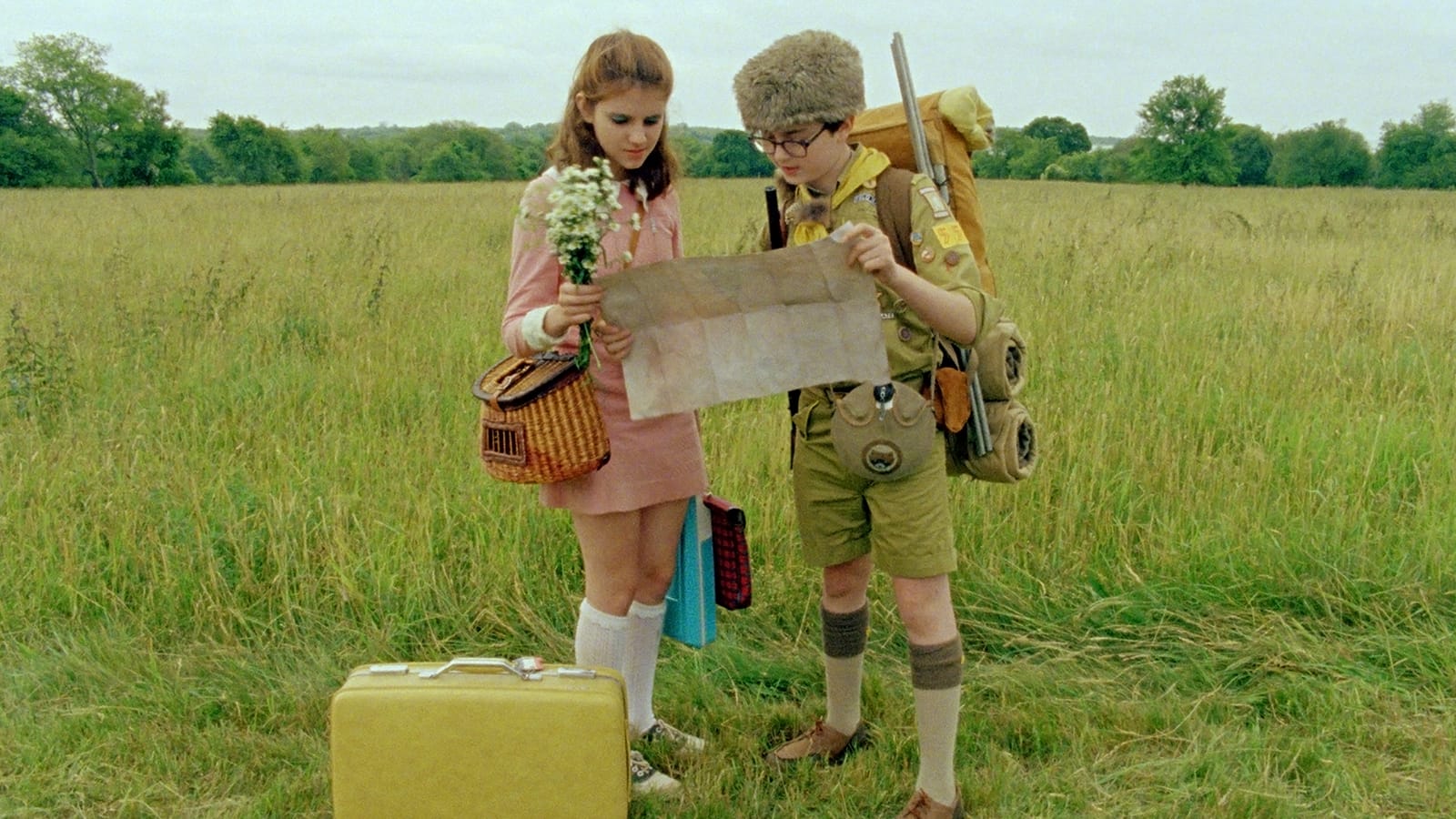
There’s a chance that Anderson’s 2012 feature Moonrise Kingdom is one of his most beloved works. Led by two young lovers, Sam and Suzy (played by Jared Gilman and Kara Hayward), the film is a nice blend of the freshness of a coming-of-age story and the nostalgic sets, props and costumes.
The film feeds our sense of adventure as we follow along Sam and Suzy’s magical-yet-short dream of running away from home. (Yes, the one that almost every young kid has for mostly no apparent reason.)
Filming was done in Rhode Island, but Anderson penned the name New Penzance for the film’s setting. The charming island plays a role the likes of a fairytale’s far-off land. It’s not a new world entirely, but distant enough from the one we live in.
That’s why Moonrise comes off like a very personal film, it’s like looking at a magical country out of a storybook but with familiar characters we might have encountered in our own lives during childhood, like parents, siblings and friends from camp. I like to call it “familiar fantasy”, something that is wonderfully out-of-touch yet still feels familiar.

(L-R) Kara Hayward and Jared Gilman in Moonrise Kingdom. Source: The Criterion Collection
In the beginning of the film, we are given a tour of Summer’s End, aka Suzy’s family’s, the Bishops’, house. The sequence is a long pan shot showcasing the house’s rooms and residents, comparable to looking at the inside of a dollhouse. With many available spaces in the house, members of the Bishop family were seen to spend most of their time separately (except for Suzy’s younger brothers, who always seem to come as a pack).
The Royal Tenenbaums
Unlike the fictional regions of Zubrowka and New Penzance, The Royal Tenenbaums was set in New York City. But like the two other films, this one also features a space created for its characters.
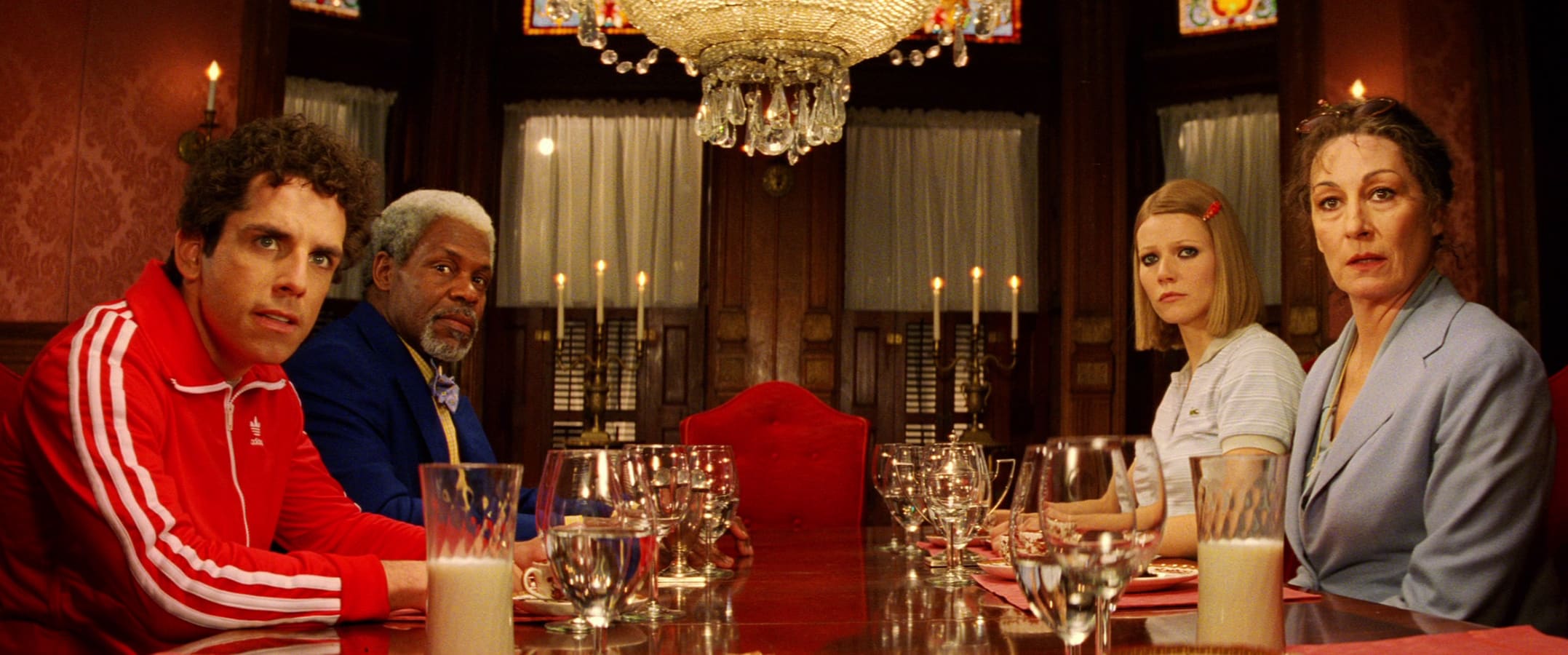
Similar to Moonrise, this film also spotlights a dollhouse-like family home shown through a pan shot tour. Unlike the Bishops’ tour, the Tenenbaums’ features a narrated backstory (voiced by Alec Baldwin) of the three young Tenenbaums, accompanied by the background tune of “Hey Jude”. Scenes of the family home were shot in a refurbished house in Harlem. From Chaz’s monotoned room-slash-office, Margot’s snug playwriting nook, to Richie’s attic, it’s clear how Anderson crafted his sets so that each character’s individual corner of the house reflected their own lives and personality.
So, what makes a Wes Anderson world?
Looking at the production design of the three films, Wes Anderson and his team consistently work to create a seamless fusion of the reality and the imagined. It’s no wonder that the processes of making these worlds include careful research and frame-by-frame planning. Deliberate styling is done in accordance to the film’s needs, therefore Anderson’s characters and stories bleed through his sets (in a nice, charming way), just like how the Tenenbaums’ and Bishops’ make their houses their own, and how Gustave runs The Grand Budapest.

(L-R) Ben Stiller, Danny Glover, Gwyneth Paltrow and Anjelica Huston in The Royal Tenenbaums. Source: The Criterion Collection
In these films, there is a balance between the simplicity of real-life and the director’s own flair, thus creating an alternate universe that is both familiar and foreign. There are next to no product placement and notable monuments—a scene in Tenenbaums even purposefully “hid” The Statue of Liberty from the audience’s view. Instead they rename locations, for example in the beginning of Tenenbaums, family patriarch Royal was seen staying at a hotel called The Lindbergh Palace, but the scenes were shot at the Waldorf. Audiences are not given the indulgence of the touches of the real world, thus are encouraged to imagine a new one.
Doing this allows Anderson’s films to shine its own magic while at the same time being able to relate the core story with the audience. They are familiar enough to feed our nostalgia, but evoking just enough distinctiveness for the imagination too. The best kind of style or aesthetic are the ones that bring out genuine stories alongside them.
Knowing all this now, we can most likely look forward to more of Anderson’s familiar fantasy in The French Dispatch, out in theaters this month.
Featured Image Courtesy of Searchlight Pictures. © 2021 20th Century Studios All Rights Reserved


